What is a Responsive Website and Why is It Important?
24-03-2025
What is a Responsive Website and Why is It Important?
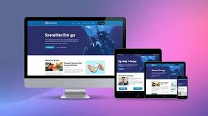
In today’s digital world, it’s crucial to have a website that looks great on all devices. A responsive website adapts its layout and content to fit any screen size—be it a mobile phone, tablet, laptop, or desktop. This ensures that your site is user-friendly and accessible, regardless of the device being used.
1. What is a Responsive Website?
A responsive website automatically adjusts its design based on the device's screen size. Whether viewed on a large desktop or a small phone, the website’s layout, text, and images will resize to fit the screen perfectly.
👉 Want your website to look great on all devices? Contact DevTechEra today!
2. Why is a Responsive Website Important?
- Better User Experience - A responsive website gives users a smooth and enjoyable experience on any device, leading to higher engagement and better conversion rates.
- Improved SEO Rankings - Google prefers responsive websites because they use a single URL, making it easier for search engines to index and rank them.
- Cost-Effective - Instead of building separate sites for mobile and desktop users, a responsive design saves time and money by creating one unified website.
👉 Don't miss out on mobile traffic. Let’s create a responsive design for your website today!
3. How Does It Work?
Responsive websites use:
- Flexible Grids: Elements resize based on screen size.
- Fluid Images: Images adjust to fit the screen.
- CSS Media Queries: Tailor the layout for different devices.
4. Why Your Business Needs a Responsive Website
A responsive site:
- Reaches more users, especially mobile visitors.
- Keeps users engaged with a seamless experience.
- Builds trust with a professional, modern design.
👉 Ready to boost your online presence? Let’s build your responsive website today with DevTechEra!
5. How We Can Help
At DevTechEra, we specialize in creating custom responsive websites that perform seamlessly on all devices. Our expert team ensures your website is both user-friendly and visually appealing.
👉 Let’s get started! Contact DevTechEra to design your responsive website today.
6. Conclusion
A responsive website is essential for staying competitive in today’s digital world. It improves user experience, boosts SEO, and saves costs. Don’t wait—upgrade to a responsive design and reach a broader audience now! Explore more
👉 Ready to upgrade your website? Get in touch with DevTechEra now!
Latest posts


Suggested Blogs
You may also like
Build a Lightning-Fast, Mobile-First Website for Your Business
Build a lightning-fast, mobile-first website to boost SEO, speed, and conversions. Optimize your site with expert web development services from Devtechera.
Read More
The Do's and Don'ts of Website Design & Development: A No-Nonsense Guide
Discover the essential do’s and don’ts of website design & development to build a fast, responsive, and SEO-friendly website that keeps users engaged.
Read More
What is the Best Technology for Building a Website?
Explore the best technologies for building websites in 2025 — from WordPress to React, Laravel, and Shopify. Choose the right tech stack for your business.
Read More